Project Summary
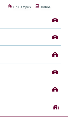
This project aimed to clean up the Program List Components hierarchy in hopes to eliminate dead clicks on heat maps.
Old
Updated
Old Updated
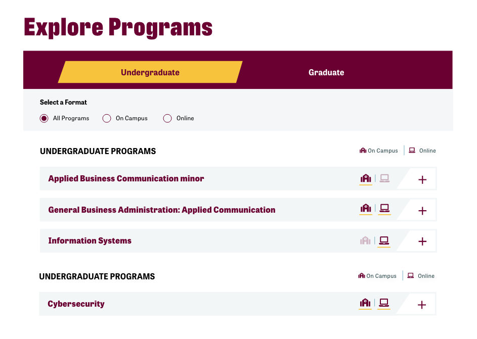
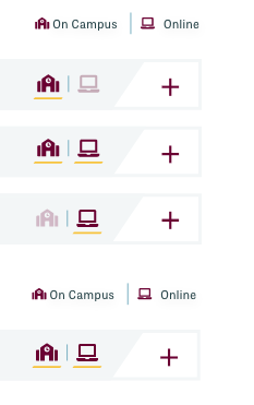
On Campus Vs Online
Adding a spot for both location icons on the widget and creating active and inactive states not only prevented the icons from shifting, depending on whether one or both were offered, but also helped users quickly and more efficiently identify available options.


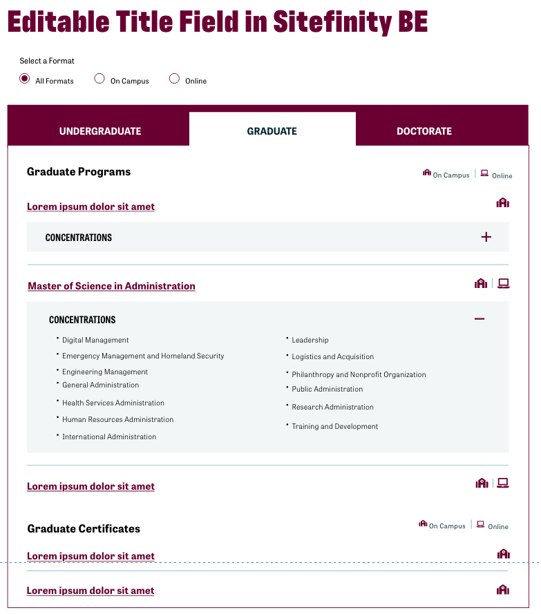
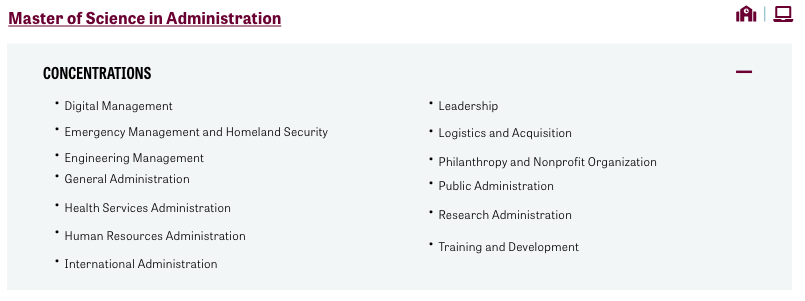
Filter Adjustments
Moving the format selection filters under the graduate level made them more recognizable as part of the component. That decision, along with switching from tabs to a gold bar, improved consistency with the site’s UI system and created a clearer hierarchy.
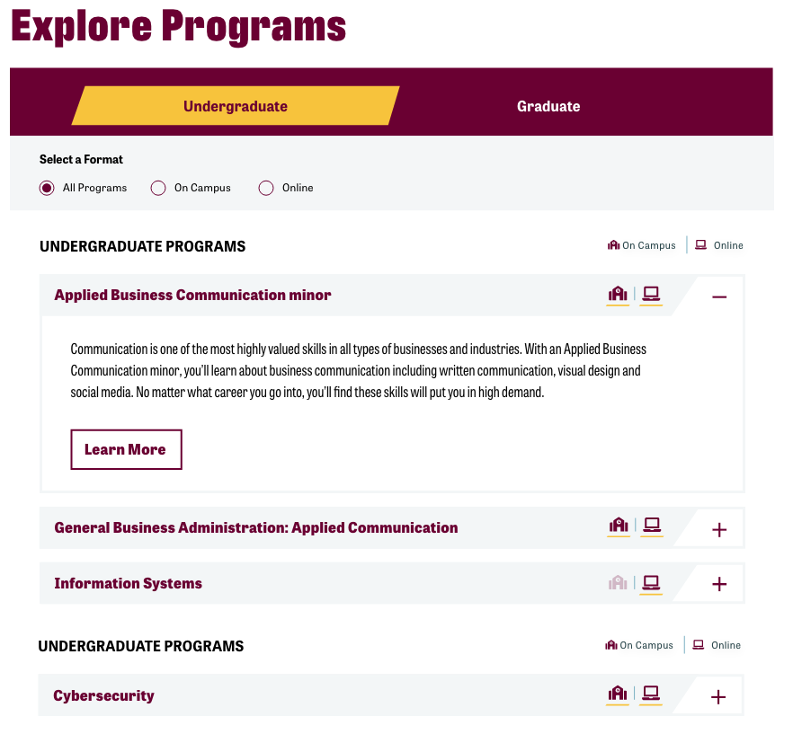
Information Hierarchy
The concentration section had too much color, drawing more attention than the actual program. Moving the color to the program improved the hierarchy. I also added a brief description to provide context and a “Learn More” to create a clear call to action.

No Program Available